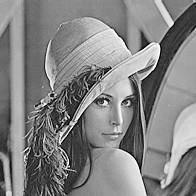
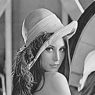
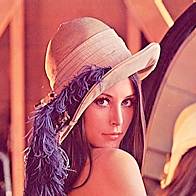
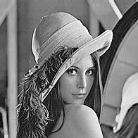
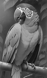
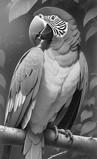


| RGB values | Hue | Colour | Grayscale | ||||
| decimal | hex | pure | Pos | Avg | Lum | ||
| 0,0,0 | #000000 | × | n/a | Black | 0 • #00 | ||
| 128,0,0 | #800000 | × | 0° | Maroon | 43 • #2b | 27 • #1b | |
| 255,0,0 | #ff0000 | ✓ | 0° | Red | 85 • #55 | 54 • #36 | |
| 112,66,20 | #704214 | × | 30° | Sepia | 66 • #42 | 72 • #48 | |
| 255,140,0 | #ff8c00 | ✓ | 32.9° | Darkorange | 132 • #84 | 154 • #9a | |
| 255,165,0 | #ffa500 | ✓ | 38.8° | Orange | 140 • #8c | 172 • #ac | |
| 255,215,0 | #ffd700 | ✓ | 50.6° | Gold | 157 • #9d | 208 • #d0 | |
| 128,128,0 | #808000 | × | 60° | Olive | 85 • #55 | 119 • #77 | |
| 255,255,0 | #ffff00 | ✓ | 60° | Yellow | 170 • #aa | 237 • #ed | |
| 127,255,0 | #7fff00 | ✓ | 90.1° | Chartreuse | 127 • #7f | 209 • #d1 | |
| 0,128,0 | #008000 | × | 120° | Green | 43 • #2b | 92 • #5c | |
| 0,255,0 | #00ff00 | ✓ | 120° | Lime | 85 • #55 | 182 • #b6 | |
| 152,251,152 | #98FB98 | × | 120° | Palegreen | 210 • #d2 | 223 • #df | |
| 0,255,127 | #00ff7f | ✓ | 149.9° | Springgreen | 127 • #7f | 192 • #c0 | |
| 64,224,208 | #40e0d0 | ~ | 174° | Turquoise | 165 • #a5 | 109 • #bd | |
| 0,128,128 | #008080 | × | 180° | Teal | 90 • #5a | 101 • #65 | |
| 0,255,255 | #00ffff | ✓ | 180° | Aqua/Cyan | 170 • #aa | 201 • #c9 | |
| 0,191,255 | #00bfff | ✓ | 195.1° | Deepskyblue | 149 • #95 | 155 • #9b | |
| 30,144,255 | #1e90ff | ~ | 209.6° | Dodgerblue | 143 • #8f | 128 • #80 | |
| 0,0,205 | #0000cd | ~ | 240° | Mediumblue | 68 • #44 | 15 • #0f | |
| 0,0,128 | #000080 | × | 240° | Navy | 43 • #2b | 9 • #09 | |
| 0,0,255 | #0000ff | ✓ | 240° | Blue | 85 • #55 | 18 • #12 | |
| 138,43,226 | #8a2be2 | ~ | 271.1° | Blueviolet | 136 • #88 | 76 • #4c | |
| 255,0,255 | #ff00ff | ✓ | 300° | Magenta | 170 • #aa | 73 • #49 | |
| 128,0,128 | #800080 | × | 300° | Purple | 83 • #53 | 54 • #36 | |
| 238,130,238 | #ee82ee | × | 300° | Violet | 202 • #ca | 161 • #a1 | |
| 255,20,147 | #ff1493 | ~ | 327.6° | Deeppink | 141 • #8d | 79 • #4f | |
| 255,255,255 | #ffffff | × | n/a | White | 255 • #ff | ||
| Average | BT.601 | Original | BT.709 |
| | | |
| | | |
| Original | Hue/Saturation | Lightness |
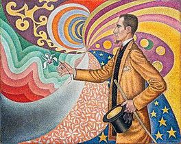 |  |  |
| As overlay on background checkerboard pattern. | ||
|
At first glance, the bare hue/saturation part (containing the color info) looks surprisingly washed out, which only underlines the importance of the lightness component with its distinctive structural and textural features produced by light/shadow contrast and gradients. Another way of visualizing color info would be to look at chroma (by which we actually mean 'colourfulness', but gladly denominations in this context happen to be loose in general, so we prefer the shorter expression). Its values, here the range [0…255], can neatly be turned into a grayscale image: | ||
| Chroma | We already met chroma (as can best be analysed in a bi-cone model), which, under the hood, represents the spread of RGB channel values, that is, the distance (absolute difference) between lowest and highest value. The higher a color’s chroma, the closer it is to being a pure hue tone. The lower its chroma, the closer to being a grayscale tone. From that, it’s easy to see why every node on the hue line has always one channel at zero, and another at 255, resulting in a maximum spread, thus possessing full chroma. | |
 | ||
| Hue | ||
| Speaking of, this is how an explicit hue layer would look like, if (by maximazing chroma) each pixel is purified to its actual intrinsic hue colour. Side note: HSL’s saturation is defined by chroma per max(r,g,b); or C/V in short. |  | |
| Lightness on Gray | ||
 | Expectedly, overlaying lightness on mid Gray, aka rgb(128,128,128) #80808, results in a grayscale representation of the image. | |
| Below, for comparison, the versions of aforementioned common conversion methods: | ||
 |  | 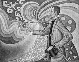 |
| Average | BT.601 | BT.709 |
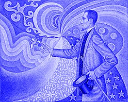
 A LiDa (as I like to call them - for Light/Dark) is conceptually rather simple: its pixels, having individual transparency, are either Black (to apply shade) or White (to apply tint).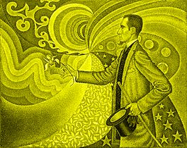
| Hue | BT.601 | BT.709 | ||||||||
| Split | gray | dec | hex | Split | gray | dec | hex | |||
| Red | 29.9 : 70.1 | 76 | #4c | 21.3 : 78.7 | 54 | #36 | ||||
| Yellow | 88.6 : 11.4 | 226 | #e2 | 92.8 : 7.2 | 237 | #ed | ||||
| Lime | 58.7 : 41.3 | 150 | #96 | 71.5 : 28.5 | 182 | #b6 | ||||
| Aqua/Cyan | 70.1 : 29.9 | 179 | #b3 | 78.7 : 21.3 | 201 | #c9 | ||||
| Blue | 11.4 : 88.6 | 29 | #1d | 7.2 : 92.8 | 18 | #12 | ||||
| Magenta | 41.3 : 58.7 | 105 | #69 | 28.5 : 71.5 | 73 | #49 | ||||
| Colour | RGB values | HSL parameter | ||||
| Hue | Tone | decimal | hex | Hue | Sat(%) | Lig(%) |
| Red | 216,89,89 | #d85959 | 0° | 61.95 | 59.8 | |
| Yellow | 141,141,14 | #8d8d0e | 60° | 81.94 | 30.39 | |
| Lime | 52,179,52 | #34B334 | 120° | 54.98 | 45.29 | |
| Aqua/Cyan | 38,165,165 | #26a5a5 | 180° | 62.56 | 39.8 | |
| Blue | 113,113,240 | #7171f0 | 240° | 80.89 | 69.22 | |
| Magenta | 202,75,202 | #ca4bca | 300° | 54.51 | 54.31 | |
| Seasons lite | ||||
| Winter | Spring | Summer | Autumn | |
| CSS | #40ffff | #00ffa0 | #ffd080 | #d0c0a0 |
| RGB | 64,255,255 | 0,255,160 | 255,208,128 | 208,224,160 |
| HSL | 180,100%,63% | 158,100%,50% | 38,100%,75% | 75,51%,75% |
| Months lite | ||||||
| Winter (cold/blue) | Spring (warm/green) | |||||
| December | January | February | March | April | May | |
| CSS | #b9c7f5 | #b9e0f4 | #b8f3ee | #b8f4d6 | #b8f4bd | #ccf4b8 |
| RGB | 185,199,245 | 185,224,244 | 184,243,238 | 184,244,214 | 184,244,189 | 204,244,184 |
| HSL | 226,75%,84% | 200,73%,84% | 175,71%,84% | 150,73%,84% | 125,73%,84% | 100,73%,84% |
| Summer (hot/yellow) | Autumn (mixed/magenta) | |||||
| June | July | August | September | October | November | |
| CSS | #b9c7f5 | #b9e0f4 | #b8f3ee | #b8f4d6 | #b8f4bd | #ccf4b8 |
| RGB | 229,234,183 | 243,235,184 | 244,210,184 | 244,186,185 | 255,185,221 | 195,185,245 |
| HSL | 66,55%,82% | 52,71%,84% | 26,73%,84% | 1,73%,84% | 329,100%,86% | 250,75%,84% |
| Cell text/background | ||||||
| dark red | dark orange | dark brown | dark yellow | dark green | dark cyan | |
| CSS | #cc0000 | #ee7700 | #775500 | #aaaa00 | #006633 | #009999 |
| RGB | 204,0,0 | 238,119,0 | 119,85,0 | 170,170,0 | 0,102,51 | 0,153,153 |
| HSL | 0,100%,40% | 30,100%,47% | 43,100%,23% | 60,100%,33% | 150,100%,20% | 180,100%,30% |
| dark blue | dark magenta | dark gray/pink | red | orange | brown | |
| Text | Text | Text | ||||
| CSS | #5555ff | #990077 | #cc66aa | #ff8888 | #ffbb00 | #bb9900 |
| RGB | 85,85,255 | 153,0,119 | 204,102,170 | 255,136,136 | 255,187,0 | 187,153,0 |
| HSL | 240,100%,67% | 313,100%,30% | 320,50%,60% | 0,100%,77% | 44,100%,50% | 49,100%,37% |
| yellow | green | cyan | blue | magenta | gray/pink | |
| Text | Text | Text | Text | Text | Text | |
| CSS | #ffff00 | #00cc66 | #66ddff | #aaaaff | #ff66cc | #ffbbdd |
| RGB | 255,255,0 | 0,204,102 | 255,187,221 | 170,170,255 | 255,102,204 | 195,185,245 |
| HSL | 60,100%,50% | 150,100%,40% | 193,100%,70% | 240,100%,83% | 320,100%,70% | 330,100%,87% |
| Text colours for dark background 51 • #33 • hsl(0,0,20%) Text Text Text Text Text Text Text Text | ||||||
| red | orange | brown | green | |||
| CSS | #ff4444 | #ff8800 | #aaaa00 | #00aa55 | ||
| RGB | 255,68,68 | 255,136,0 | 170,170,0 | 0,170,85 | ||
| HSL | 0,100%,63% | 32,100%,50% | 60,100%,33% | 150,100%,33% | ||
| cyan | blue | magenta | pink | |||
| CSS | #0099aa | #8888ff | #ee00dd | #ff0088 | ||
| RGB | 0,153,170 | 136,136,255 | 238,0,221 | 255,0,136 | ||
| HSL | 186,100%,33% | 240,100%,77% | 304,100%,47% | 328,100%,50% | ||
| Dark/light tones | ||||||
| dark red | dark orange | dark yellow | dark green 1 | dark green 2 | dark cyan | |
| CSS | #990000 | #aa5500 | #999900 | #006633 | #008844 | #008888 |
| RGB | 153,0,0 | 170,85,0 | 153,153,0 | 0,102,51 | 0,136,68 | 0,136,136 |
| HSL | 0,100%,30% | 30,100%,33% | 60,100%,30% | 150,100%,20% | 150,100%,27% | 180,100%,27% |
| dark blue 1 | dark blue 2 | dark magenta | red | orange | yellow | |
| CSS | #4444ff | #6666ff | #990099 | #ff7777 | #ff9900 | #ffff00 |
| RGB | 68,68,255 | 102,102,255 | 153,0,153 | 255,119,199 | 255,153,0 | 255,255,0 |
| HSL | 240,100%,63% | 240,100%,70% | 300,100%,30% | 325,100%,73% | 36,100%,50% | 60,100%,50% |
| green 1 | green 2 | cyan | blue 1 | blue 2 | magenta | |
| CSS | #00cc66 | #00ff88 | #00dddd | #8888ff | #ccccff | #ff66ff |
| RGB | 0,204,102 | 0,255,136 | 0,221,221 | 136,136,255 | 204,204,255 | 255,102,255 |
| HSL | 150,100%,40% | 152,100%,50% | 180,100%,43% | 240,100%,77% | 240,100%,90% | 300,100%,70% |
| Text tones for gray background 204 • #cc • hsl(0,0,80%) 1 2 3 4 5 6 7 8 | ||||||
| 1 (blue) | 2 (magenta) | 3 (red) | 4 (green) | |||
| CSS | #0000ff | #c000c0 | #ff0000 | #007f00 | ||
| RGB | 0,0,255 | 192,0,192 | 255,0,0 | 0,127,0 | ||
| HSL | 240,100%,50% | 300,100%,38% | 0,100%,50% | 120,100%,25% | ||
| 5 (brown) | 6 (cyan) | 7 (mid blue) | 8 (pink) | |||
| CSS | #808000 | #408080 | #7f7fff | #ff0080 | ||
| RGB | 128,128,0 | 64,128,128 | 127,127,255 | 255,0,128 | ||
| HSL | 60,100%,25% | 180,33%,38% | 240,100%,75% | 330,100%,50% | ||
| Warm/cold tones | ||||||
| red | orange | dark yellow | yellow | green | dark green | |
| CSS | #ff6666 | #ff8800 | #cccc00 | #eeee00 | #88dd88 | #00cc55 |
| RGB | 255,102,102 | 255,136,0 | 204,204,0 | 238,238,0 | 136,221,136 | 0,204,85 |
| HSL | 0,100%,70% | 30,100%,33% | 60,100%,30% | 150,100%,20% | 150,100%,27% | 180,100%,27% |
| turquoise | cyan | blue | lite blue | pink | magenta | |
| CSS | #00ddcc | #00ffff | #8888ff | #9999ff | #ff22cc | #ff44bb |
| RGB | 0,221,204 | 0,255,255 | 136,136,255 | 153,153,255 | 255,34,204 | 255,68,187 |
| HSL | 175,100%,43% | 180,100%,50% | 240,100%,77% | 240,100%,80% | 314,100%,57% | 322,100%,63% |
| Armchair/sofa tones | ||||||
| red | orange | brown | yellow | |||
| CSS | #ff0000 | #ff8800 | #448800 | #dddd00 | ||
| RGB | 255,0,0 | 255,136,0 | 68,136,0 | 221,221,0 | ||
| HSL | 0,100%,50% | 32,100%,50% | 90,100%,27% | 60,100%,43% | ||
| green | cyan | blue | magenta | |||
| CSS | #00cc66 | #00ddff | #7777ff | #ff00bb | ||
| RGB | 0,204,102 | 0,221,255 | 119,119,255 | 255,0,187 | ||
| HSL | 150,100%,40% | 188,100%,50% | 240,100%,73% | 316,100%,50% | ||
| Game card design | |||||
| Board bg | |||||
| Travel front | Travel front2 | ||||
| Railroad | Estate front | Estate front2 | Group 1 | Group 2 | |
| CSS | #ddddcc | #eeeedd | #ffffee | #993399 | #77ccff |
| RGB | 221,221,204 | 238,238,221 | 255,255,238 | 153,51,153 | 119,204,255 |
| HSL | 60,20%,83% | 60,33%,90% | 60,100%,97% | 300,50%,40% | 203,100%,73% |
| Community | |||||
| front | front2 | backside | Group 3 | Group 4 | |
| CSS | #aaddff | #cceeff | #a8dafc | #cc44cc | #ff9900 |
| RGB | 170,221,255 | 204,238,255 | 168,218,252 | 204,68,204 | 255,153,0 |
| HSL | 204,100%,83% | 200,100%,90% | 204,93%,82% | 300,57%,53% | 36,100%,50% |
| Chance | |||||
| front | front2 | backside | Group 5 | Group 6 | |
| CSS | #ffaadd | #ffddee | #fca8db | #ff2222 | #dddd44 |
| RGB | 255,170,221 | 255,221,238 | 252,168,219 | 255,34,34 | 221,221,68 |
| HSL | 324,100%,83% | 330,100%,93% | 324,93%,82% | 0,100%,57% | 60,69%,57% |
| Lottery | |||||
| front | front2 | backside | Group 7 | Group 8 | |
| CSS | #aaffaa | #ccffcc | #a8fca8 | #00aa55 | #2222ee |
| RGB | 170,255,170 | 204,255,204 | 168,252,168 | 0,170,85 | 34,34,238 |
| HSL | 120,100%,83% | 120,100%,90% | 120,93%,82% | 150,100%,33% | 240,86%,53% |
| Utility | Group 9 | Group 10 | Group 11 | Group 12 | |
| CSS | #999988 | #ff3388 | #888800 | #00ff88 | #8811ff |
| RGB | 153,153,136 | 255,51,136 | 136,136,0 | 0,255,136 | 136,17,255 |
| HSL | 60,8%,57% | 335,100%,60% | 60,100%,27% | 152,100%,50% | 270,100%,53% |
 For stylization purposes, e.g. giving game card motifs a yellowish tint and blueish shadows, the tone pair of a LiDa could be created accordingly.